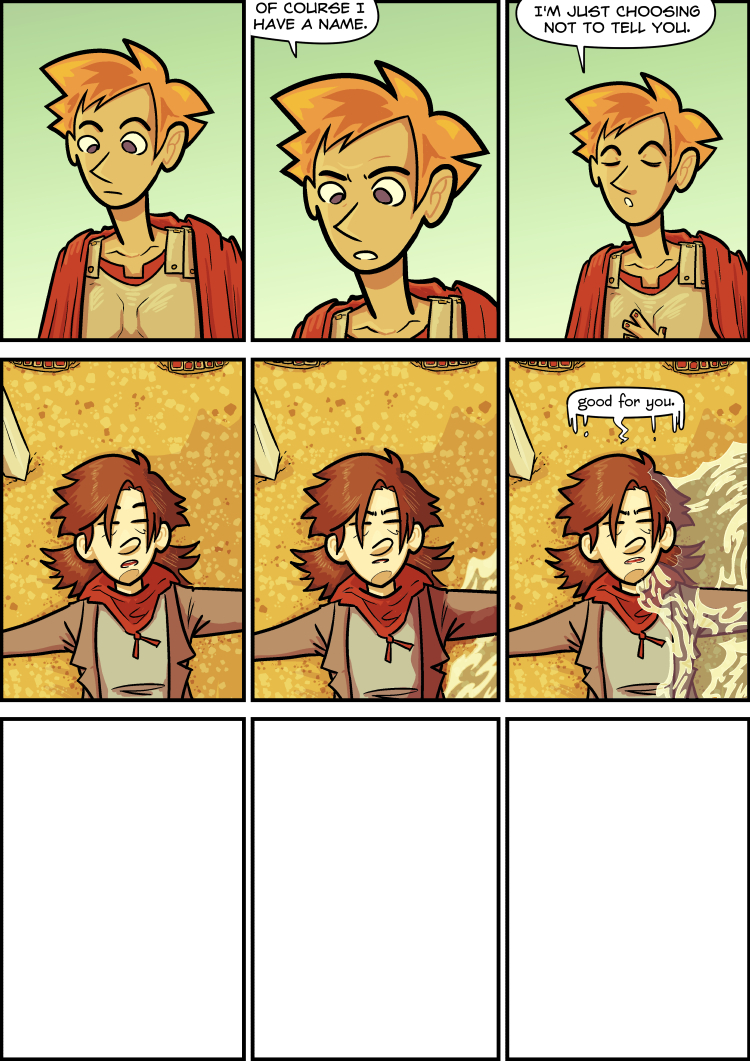
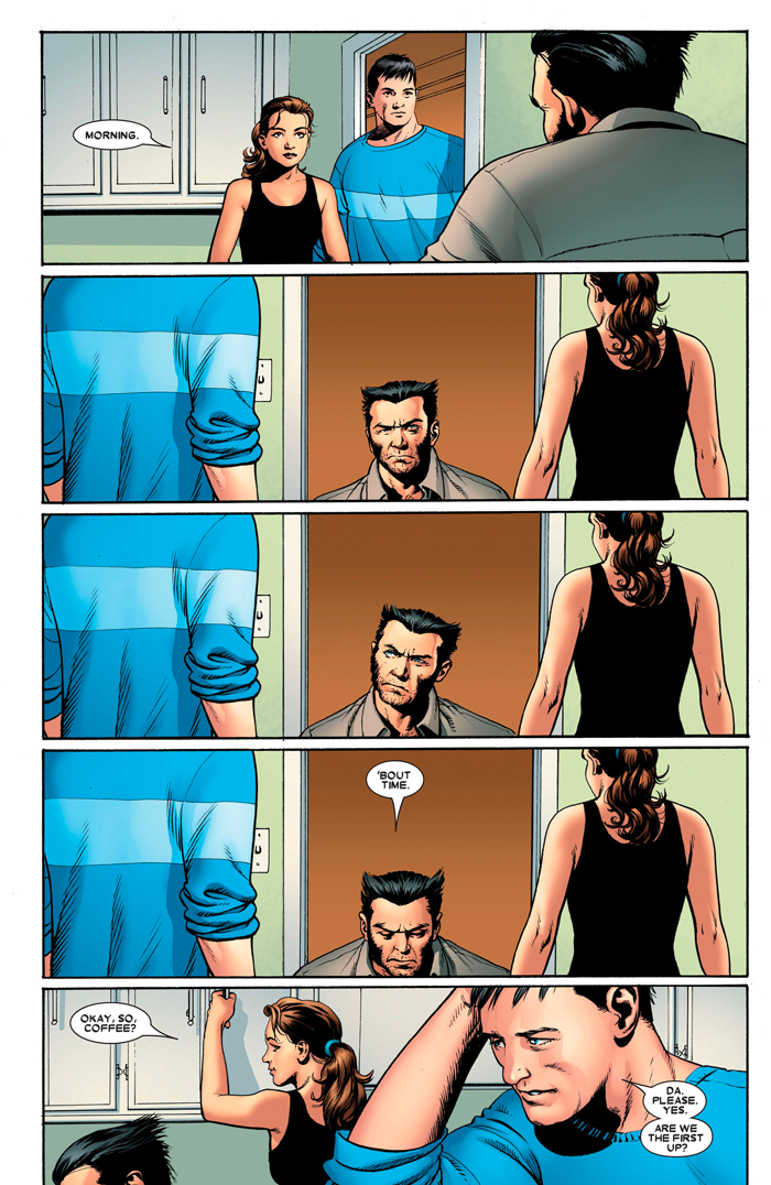
This one is wrong. I'm using the "1970s" designs, but the colouring is too modern. (see my own strip Noirtown for a good example -- I'm not doing anything differently here). The pacing is also totally wrong for the 1970s -- it's way too decompressed. Compare this page, Astonishing X-Men #14, 2005:
to this one, from Uncanny X-Men #98, 1976:
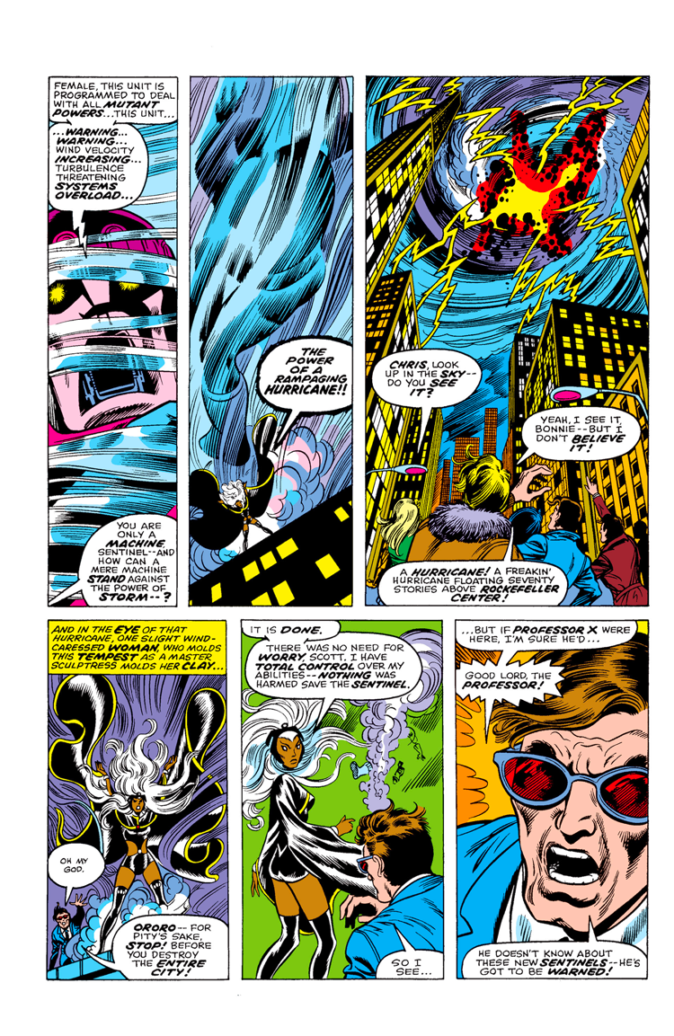
The 2005 pages takes its time to deliver its information in a way that makes the 1976 page look absolutely fucking breathless. Though the 2005 page is somewhat infamous, both are relatively normal for their respective times.

to this one, from Uncanny X-Men #98, 1976:

The 2005 pages takes its time to deliver its information in a way that makes the 1976 page look absolutely fucking breathless. Though the 2005 page is somewhat infamous, both are relatively normal for their respective times.
Transcript:
AQUILA: [stares blankly]
AQUILA: "Of course I have a name."
AQUILA: "I'm just choosing not to tell you."
AVI, lying down on the beach: [squinting]
AVI: [tries to figure out what to say]
AVI, a wave washing over her: "good for you."
AQUILA: [stares blankly]
AQUILA: "Of course I have a name."
AQUILA: "I'm just choosing not to tell you."
AVI, lying down on the beach: [squinting]
AVI: [tries to figure out what to say]
AVI, a wave washing over her: "good for you."

